Item Tree
When the Item List Configuration page initially loads, it displays all nodes (item tree categories) and items from the item tree group that is set with the TopNode.
Editing Nodes and Items
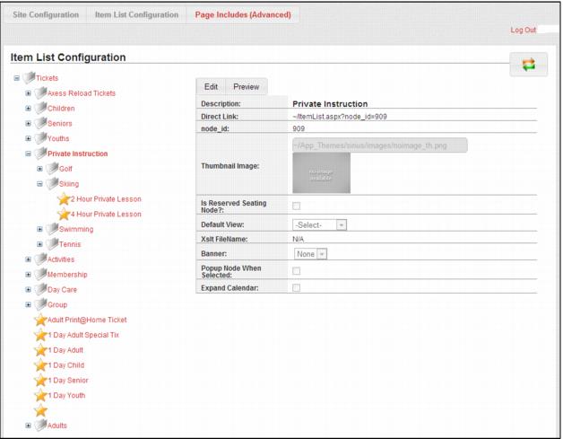
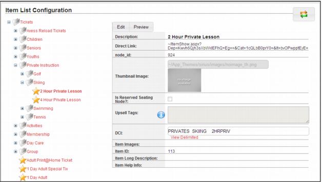
Nodes (item tree categories or groups) are displayed with a white and gray file folder icon next to the name along with the standard + icon to the left of the folder indicating that you can expand down into that node to access additional nodes/items. Items are displayed with a gold star icon to the left of the name. To edit a node or item, select it from the list, and then click the Edit tab to put the form into edit mode. To save changes, click the Save button at the bottom of the form. To exit edit mode without saving changes, click the Cancel button at the bottom of the form.
Example:
Node edit form prior to clicking on the Edit tab:
Example:
The Item Edit form before clicking on the Edit tab:
Note: You must click the Save button for each node/item edited. If you navigate to a different node/item while still in edit mode you lose any changes that you made to the original node/item.
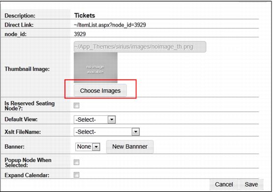
Thumbnail images
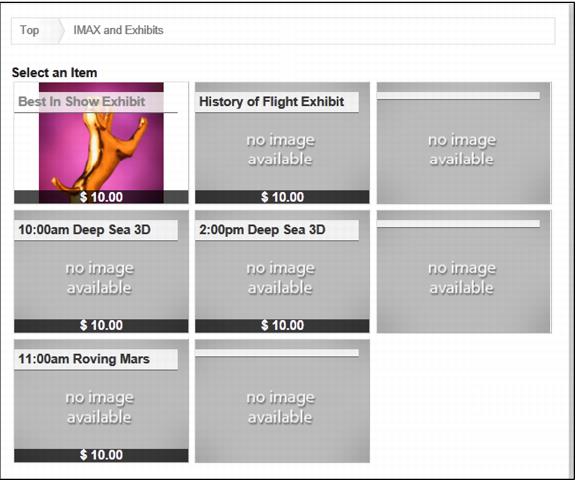
Thumbnail images are used when the Default View for a node is set to ThumbView rather than ListView. The pages displays thumbnail images for nodes and items on the ItemList.aspx page.
Note: The Default View can be set site-wide for all nodes and items using the DefaultListView key in SiteConfig.config. If that key is set to ThumbView, then you only need to set DefaultView for a node if you want to override that setting for that node.
When in edit mode, the Thumbnail Image section expands to include a Choose Images button.
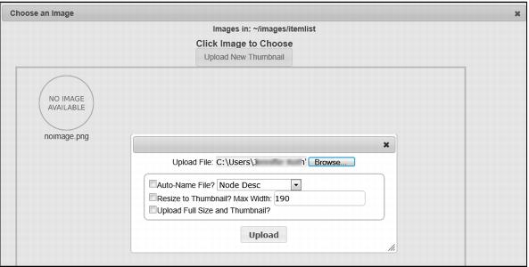
When clicked, the user is taken to the Choose an Image dialog where they can either select an existing image or upload a new thumbnail image to use. The thumbnail image is stored in images/itemlist. If editing an item and there are item image(s) defined, but no thumbnail, it uses the first item image as a thumbnail. If you define a different image for the thumbnail, it uses that on the ItemList.aspx page for that item.
Once you have selected and uploaded your image, you return to the Item List Configuration page. From here you can Save. You can then choose to Preview your changes.
Another itemlist.aspx page opens. Navigate to the item and you can review your changes.
Default view
This sets the default view for this node. ListView is the normal view that lists the items/nodes in a text-based grid. ThumbView is the thumbnail view that shows an image for the items/nodes. Xslt View is defined by an xslt file that can be placed in xmlfiles/xlst that dictates how the node is laid out on a page. This allows the client to totally customize the display for that node.
There is one final setting in the Default View dropdown, XsltTest. If this is selected and the user navigates to the page, it shows all the data that is fed to the page. The user then knows what fields are available and the names of the fields for their xslt file. XsltTest is never set for a production environment. If it is, it just displays a bunch of xml on the page instead of the actual itemlist.
XsltFile name
This is used to set the xslt template that is applied to the page if the user chooses Xslt View as a Default View. The xslt file is located in the XMLFiles/xslt folder.
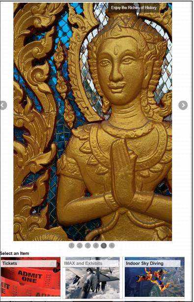
Banner
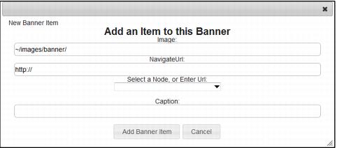
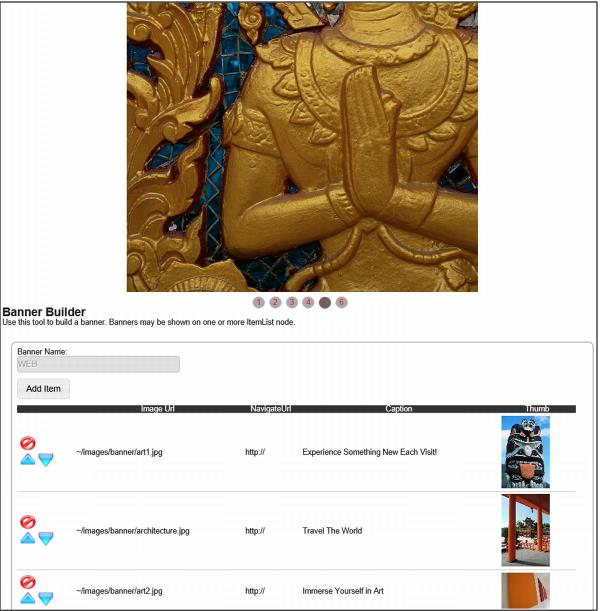
Assigning a banner to a node displays a jQuery sliding banner above the items on that node. The Banner Builder interface allows you to create multiple banners. Clicking on Add Image adds images to the banner one at a time. Each banner item allows you to define the banner image, a hyperlink and a caption.
• The Image field allows you to define the path to the image. This can be a relative path to an image that already exists on your web server or an absolute path to an image that exists elsewhere.
Note: external images likely need to be referenced via https to avoid SSL warnings.
• Banner images should be all sized to the same size in a single banner. They need to be uploaded to Images/Banner folder before setting up the banner in the site. Banners should be .png or .jpg files. The recommended height/width is 855px wide by 245px tall. The banner control will shrink them to the container (div). Individual clients are free to modify these dimensions as they see fit. The most important key to banner size is that all banners images in a single banner should be the same size, so the images don’t “jump” when the slider switches from one to the next, and that the width is equal to or greater than the width of the container they are in.
Example:
If the site is modified to make the banner 960px wide across the top, then the images should be sized accordingly. Otherwise, the banner will “stretch” the image and it will look pixelated. Likewise, if the image is much larger than its container, the image will take longer to load than necessary and will not scale as smoothly.
• The NavigateURL field allows you to define a hyperlink to that image. You can easily select an Item or Node from your ItemTree using the dropdown. Or you can define an absolute hyperlink to another location.
• The Caption field allows you to enter descriptive text that overlays on that image.
Once an image and/or caption is entered, you see the Image URL, the caption and the Thumbnail displayed on the Banner Builder page. You have the option to change the order to be displayed by selecting the blue up and down arrow icons. You can also delete an image by using the delete symbol. You are given a warning message, “Are you sure you want to delete this Banner Item?”
You can then choose to Create, Save, Refresh or Delete the Banner. Once you have created the banner, select the appropriate node and click on the Edit tab. Under the Banner dropdown you now see the name of your Banner. Select this banner and hit Save. You can then Preview how your Banner displays on the page
Popup node
Choosing this check box causes the node to be displayed in a popup window rather than displaying the Itemlist.aspx page directly in the browser.
Note: There are two new SiteConfig.config settings that also affect popups in the pages, PopupItemShow which when set to 1 displays the ItemShow.aspx page in a popup window for all items and PopupGuest which when set to 1 displays the GuestLookup.aspx, GuestSelected.aspx and GuestEdit.aspx pages in a popup window when a guest/visitor is added to an item from the cart and when setting the purchaser during checkout.
Expand Calendar
Choosing this check box causes the calendar to display on the ItemList.aspx page when the node is displayed.